

Visual language
The bitcoin symbol, the satoshi, and the imagery BSV inherits: which pieces to use in a product, which to avoid, and why.
Bitcoin's visual language was not designed. It accumulated, from a forum logo in 2010 to a Unicode character in 2017, and BSV inherits all of it. This page says which pieces to use in a BSV product, which to avoid, and why.
Knowing where each piece came from helps you tell what still works from what says the wrong thing or has aged badly.
The symbol
Where it came from
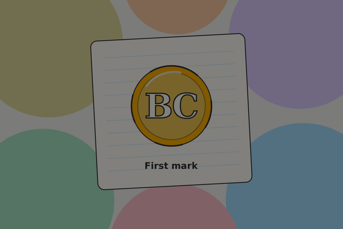
Satoshi Nakamoto's first logo, in 2010, was a gold coin with the letters BC.

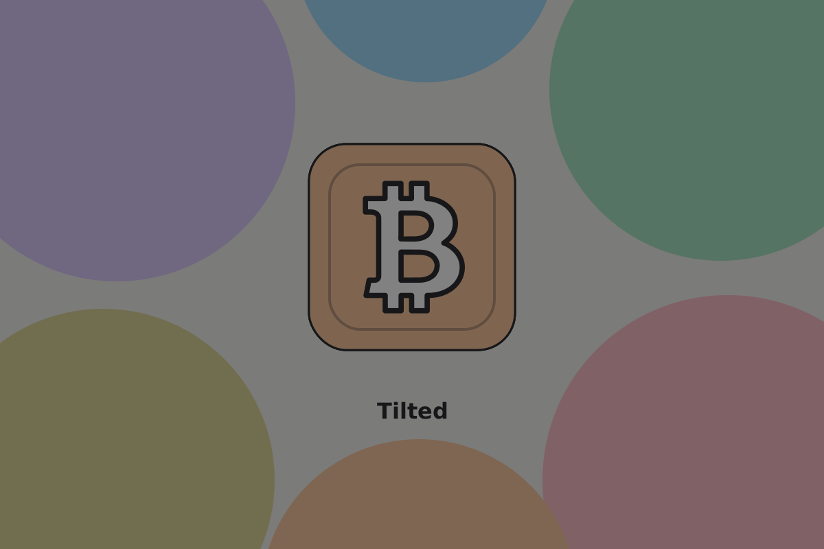
Later that year it became the letter B with two vertical strokes, in a tilted orange circle.
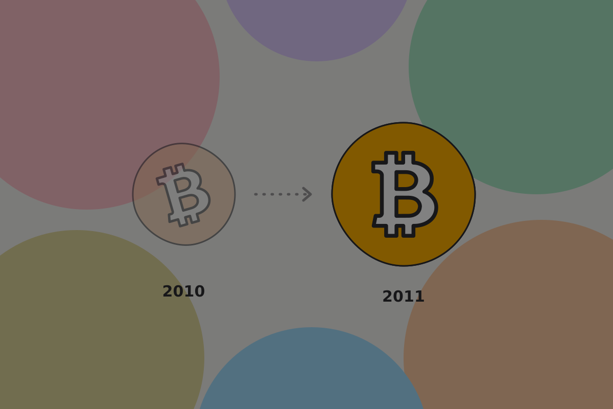
The 2011 redraw
In 2011 a designer known as Bitboy redrew it: the circle untilted, the orange brightened, the proportions regularised. He released it into the public domain, which is why it spread so widely without anybody owning it, and why every chain that came out of bitcoin inherited some version of it.
 Promotional graphics created by Bitboy.
The BSV mark
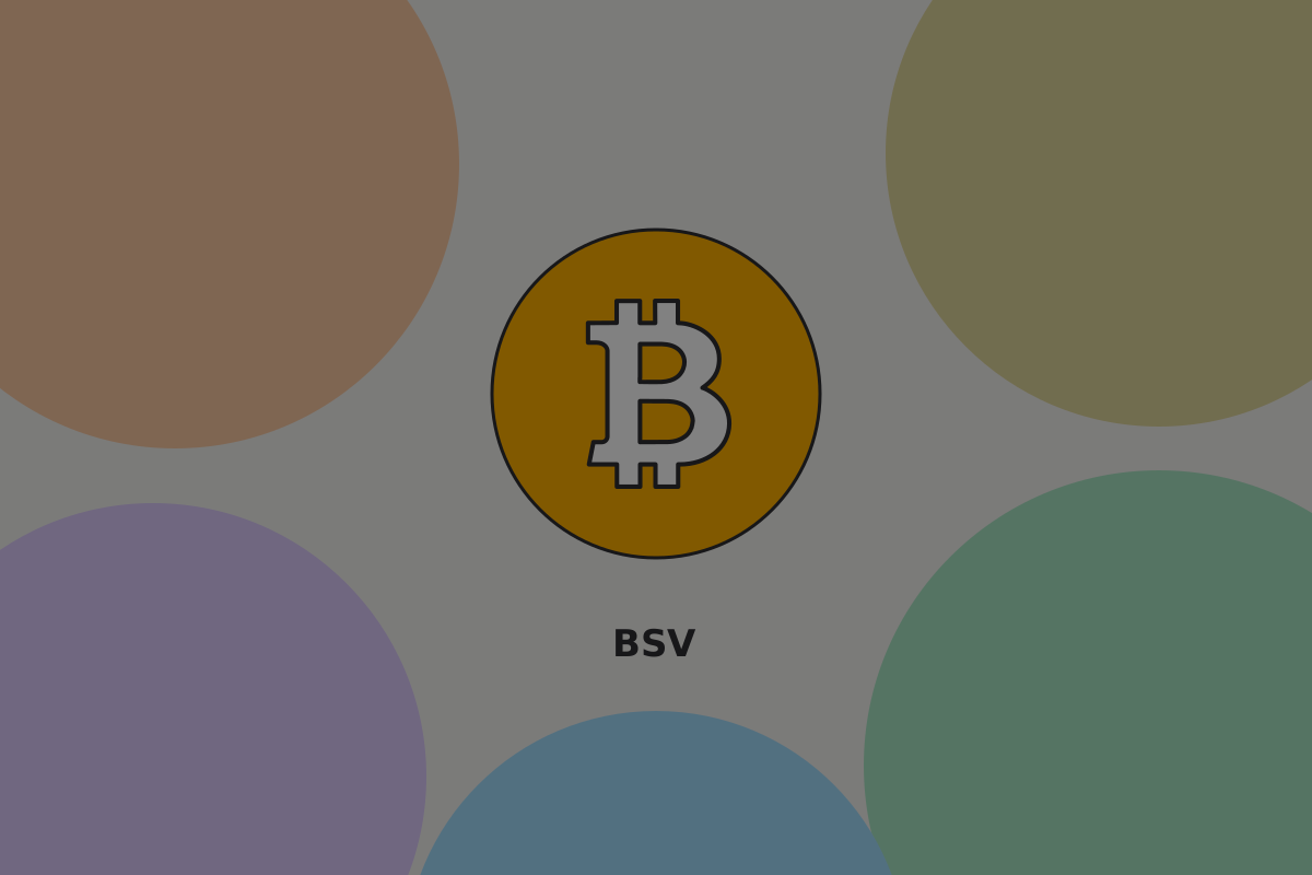
BSV keeps the B with its two strokes, and sets it upright, in white on a gold disc. The orange disc belongs to the history above; the gold one is BSV's.
Do
Use the BSV mark, the upright B on gold, wherever a BSV product needs the symbol as a mark.
Don't
Use the orange disc or a tilted B to stand for BSV. Both say a different network to anyone who knows the difference.
The Unicode character
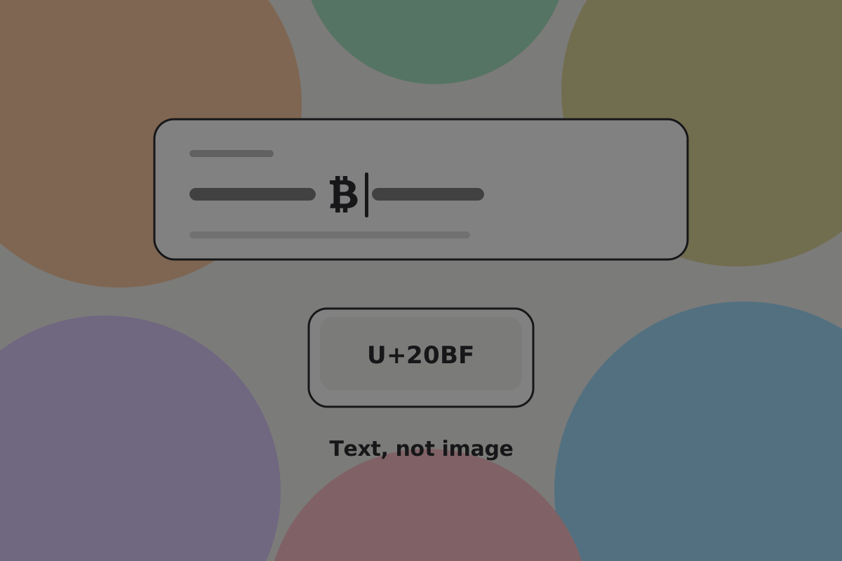
Unicode 10.0 added ₿ (U+20BF) in 2017, so the symbol can be typed as text rather than placed as an image.
Do
Use the Unicode character ₿, not the logo, when you need the bitcoin symbol in text. It scales, reflows and can be read by a screen reader. For amounts and labels, use sats and BSV; see Amounts and units.
Don't
Use the golden disc logo inside a sentence. It is a mark, not a letterform, and at text size it is a smudge.
The satoshi
A satoshi is one hundred-millionth of a bitcoin, and on BSV it is the unit people will actually meet: fees are a fraction of a penny, so amounts of a few hundred satoshis are ordinary rather than curiosities.
Several satoshi symbols have been proposed and none has been standardised, so there is no character to rely on.
Write sats in words, with grouped digits: "12,500 sats". Amounts and units has the rules.
Beyond the symbol
The gold metaphor
Orange, coins, bars, vaults. It carries the scarcity idea instantly, which is why it is everywhere.
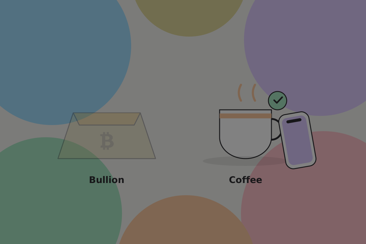
It also fights the thing BSV products usually need to say. A chain built for paying for a coffee is poorly served by imagery about bullion.
Recommendation
Reach for the gold metaphor on a savings surface and leave it off an everyday one. A payment app that looks like a vault tells people their coffee money is an investment.
Memes
Laser eyes, rockets, diamond hands, HODL. They are community in-jokes, they signal membership, and they are invisible to everyone else.

Don't
Put memes in a product. They read as a private joke to people inside and as unseriousness to people outside, and the second group is who you are trying to reach.
Illustration
Where the ecosystem's illustration is good it tends to be concrete: a hand, a phone, a note, a lock. Where it is weak it is abstract glowing networks, which look the same for every blockchain product and say nothing.

Do
Draw the thing that is happening. A payment is a person handing something to a person.
The expression scale
A scale is a useful frame here: at one end, bitcoin is the point and the interface says so; at the other, bitcoin is plumbing and the interface never mentions it.
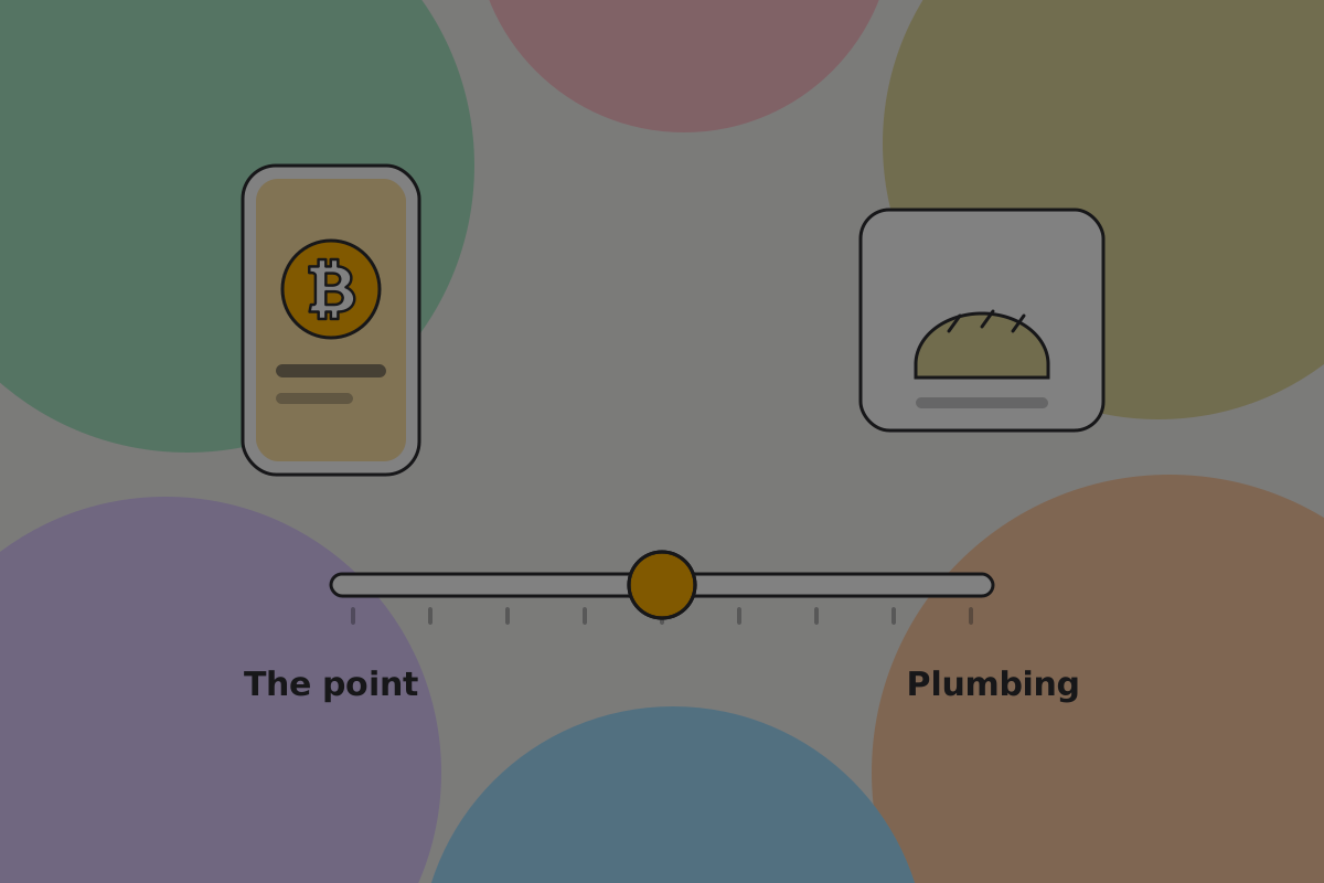
Neither end is correct. A wallet for people who care about self-custody sits near one end; a shop's point of sale sits near the other, and should, because the shopkeeper's customers are buying bread.
Do
Pick a point on the scale deliberately and hold it across the product. Drifting between the two is what produces an app that is baffling to newcomers and patronising to everyone else.
Imagery that says the wrong thing
Lightning bolts. The bolt is another payment network's mark. Borrowing it to mean "fast" tells a knowledgeable reader something untrue about your product.

Don't
Use a lightning bolt to mean speed in a BSV product. Show the thing itself: a payment confirmed while the customer is still at the till.
Partisan imagery. People argue about this field loudly and in public. A product that takes a side in its interface has made its users' money political, and a user who disagrees with the badge now distrusts the balance beside it.
Don't
Put advocacy in a product. Say what yours does and let it be judged on that.
A note on BSV's own identity
Beyond the mark above, the BSV Association has not published a full visual identity this guide can point at. Until it does, this page describes shared bitcoin heritage and what to avoid, and a product's own brand is its own decision.
Important
If the BSV Association has since published a visual identity, check this page against it and propose a change.
Related
Written from: Unicode 10.0, BSV wiki, published wallet interface surveys.
Checklist
The rules on this page, in a form you can work through.
10 rules